![]()
![]() INTERFACE
DESIGN & USABILITY TESTING PROJECTS
INTERFACE
DESIGN & USABILITY TESTING PROJECTS![]()
|
|
In Spring 2002, I worked with a team to design and create the software prototype shown here. This is the final interface I designed for the new phone. Soft keys were used for maximum flexibility with the phone's various menus, and a dedicated set of buttons was implemented for maximum web browsing usability. Those buttons were designed with colors and symbols that would be easily recognizable to our target user groups. Special buttons were included for one-handed voice operation of the phone as well. |
|
|
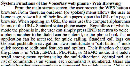
Here are some of the technical features that my group had chosen to develop for our web phone prototype. The final prototype did all of these things; it responded to a voice command to load Yahoo, downloaded the site through a proxy server, stripped out all images and text, and then displayed the site on the phone's simulated LCD screen. It could even read the site to the user. |
|
It took many weeks of planning before the prototype was ready. Our Requirements document detailed the functions that the prototype would include, how we planned on implementing those functions, and what problems could delay implementation. The link at left leads to the Requirements Document in Word format. |
|
|
|
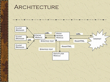
The image at left provides a small overview of the data flow that we implemented to make the prototype operational. Note that our cache module and proxy server modules are designed to support multiple client browsers. Our design would use a central processing and caching proxy server to support many web-browsing phones in a region. |
|
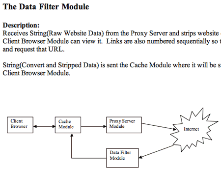
The image at left links to the Architecture Document, which provides additional details about our technical implementation. This document is in Word format. |
|
![]()
|
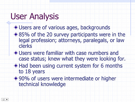
In March 2003, I designed a prototype of a new graphical records-access system for the Circuit Court of Cook County, Illinois. In my work as a paralegal, I had seen how outdated and confusing the court's current command-line interface system was. It seemed to give users a lot of trouble. I conducted user analysis to assess the target users of the new system. |
|
|
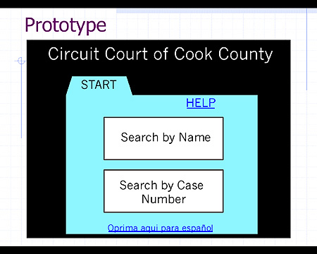
The prototype is minimalist and simple, to direct focus on layout and functionality. The new system was designed to be operated with a touch-screen display. |
|
|
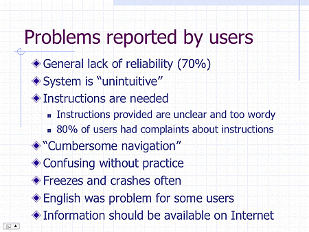
Through interviewing users of the current system, I gathered data about the most significant flaws in the current design. |
|
|
I used the data gathered to design a friendly new interface that would not suffer from the same problems.This details a few of usabilty issues that were considered before I began creation of the interface. |
|
|
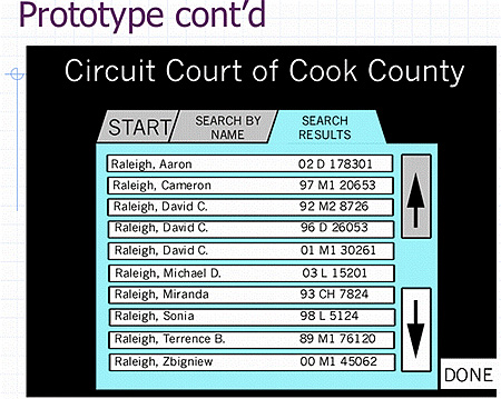
The easy-to-use tabbed interface also allows easy navigation back to previous steps, since many users reported repeating the same task many times. |
|
|
The case detail screen displays relevant court infomration in a logical and easy to read format. My new system does not display any confusing alphanumeric codes, or require such codes to activate key features. The system was designed to be easy from start to finish |
|
![]()
|
|
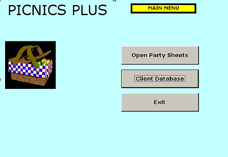
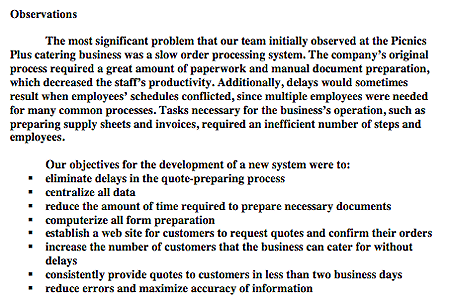
In June of 2003, I worked with a team to redesign the process flow of a small catering business to streamline operations, reduce the time and personnel required to prepare documents, and increase efficiency. I designed a DBMS and interface to increase the catering business's efficiency. It tracks upcoming jobs and prints forms. Here is the simple start screen that was created in Microsoft Access. The buttons are divdided by which employees would be using them. |
|
|
After locating the desired client from a master list, the user can edit the client's information or view parties (orders) that the client has placed. |
|
|
The party sheet level provides the greatest level of detail. Note how the interface is designed to show the layers that the user went through to get to this screen. Additionally, key information such as the active layer is highlighted in yellow for instant clarity. This new system also allows easy one-click preparation of reports such as supply sheets. |
|
My four person group prepared a 59 page report for this Information System design project. It included Data Flow Diagrams and Entity-Relationship Diagrams, plus feasibility studies, architectural overviews and more. I prepared the executive summary, and it's only two pages. It is linked to at left, as a Word file. |
|
![]()

